

A buyer’s agent in Italy, given a key and twenty regions to open.
The Property Organiser finds homes in Italy and London for buyers who live abroad, working on the buyer’s side. We rebuilt its brand around the key hidden in its own logo, and designed a site around the regions its clients dream of.




The Property Organiser · Brand system, art direction, website
Regions, walked stop by stop
Services, each one a door
Art directions presented
Key, found in the logo
The situation
An independent agent, dressed like a portal.
Buying a home in Italy from abroad means a notary you have never met, a land registry in another language, and portals full of listings that all look the same. An agent who works only for the buyer is exactly what a careful foreign client needs, and exactly what a generic property site hides.
In the firm’s own words: “Because we are an independent company, our role is to present you with the widest selection of properties that match your personal requirements.” The brand had to make that independence visible.
The insight
The logo is a key. The stem of the P descends into the O of Organiser: a ring below, a shaft above.
Its own line already said it: “Your key solution to real estate.” Everything we built opens something: an arch, a door, a region, a file.
The site, walked
A system that opens, from the logo to the last page.
Colours sampled from the logo itself, never guessed. Three directions shown at constant content, so the choice was about the brand, not the copy.
/ 06· Home
- The key, as a system
The ring became the arch that frames every photograph, the shaft a vertical rule, the key itself a seal. The teal and the brass were sampled from the original files.
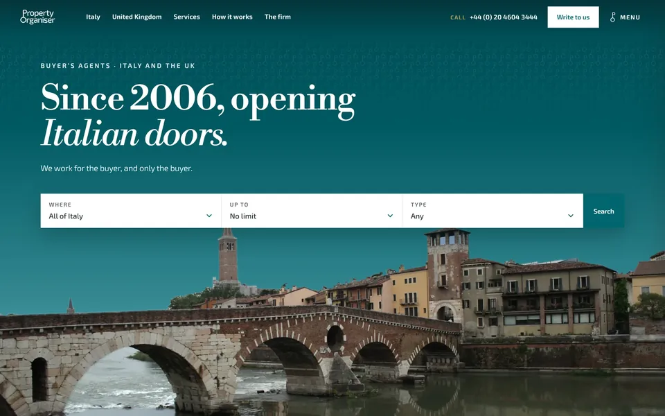
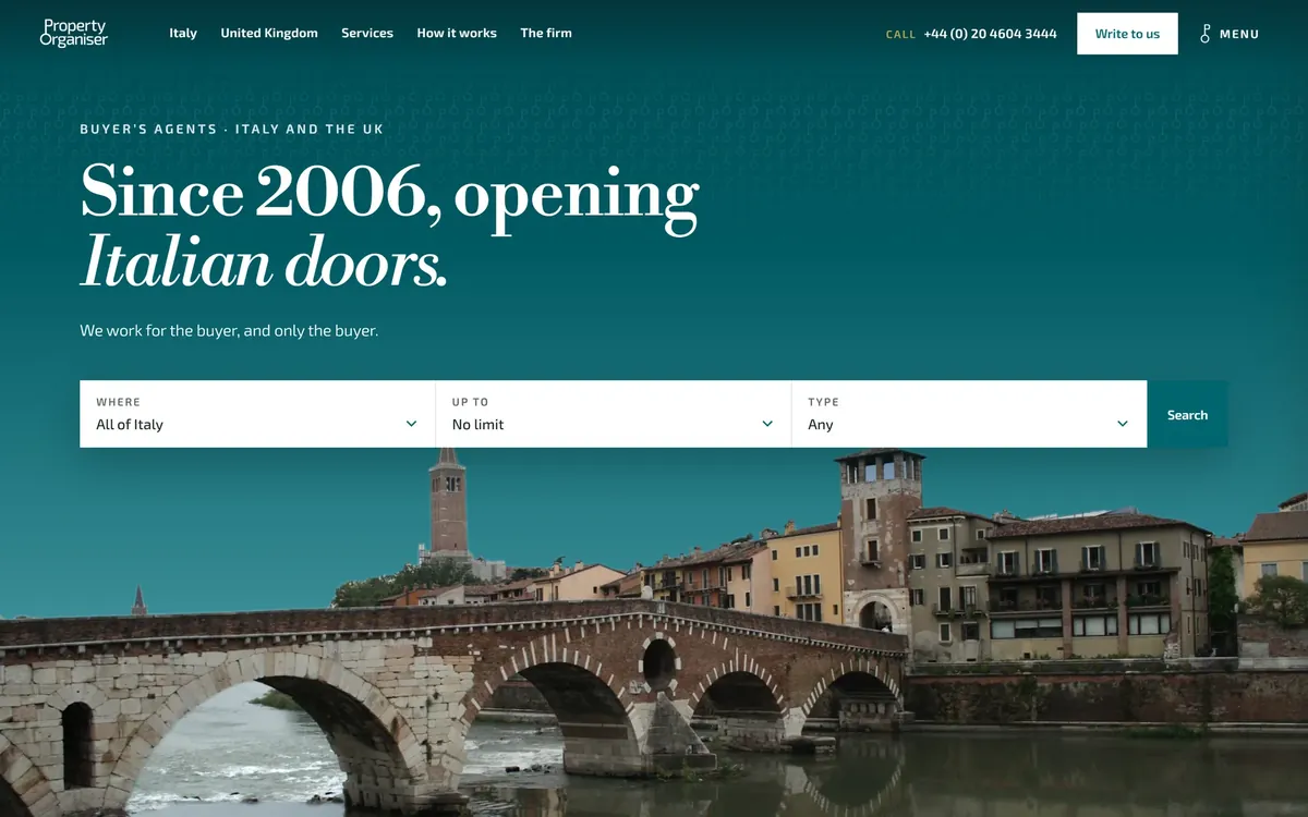
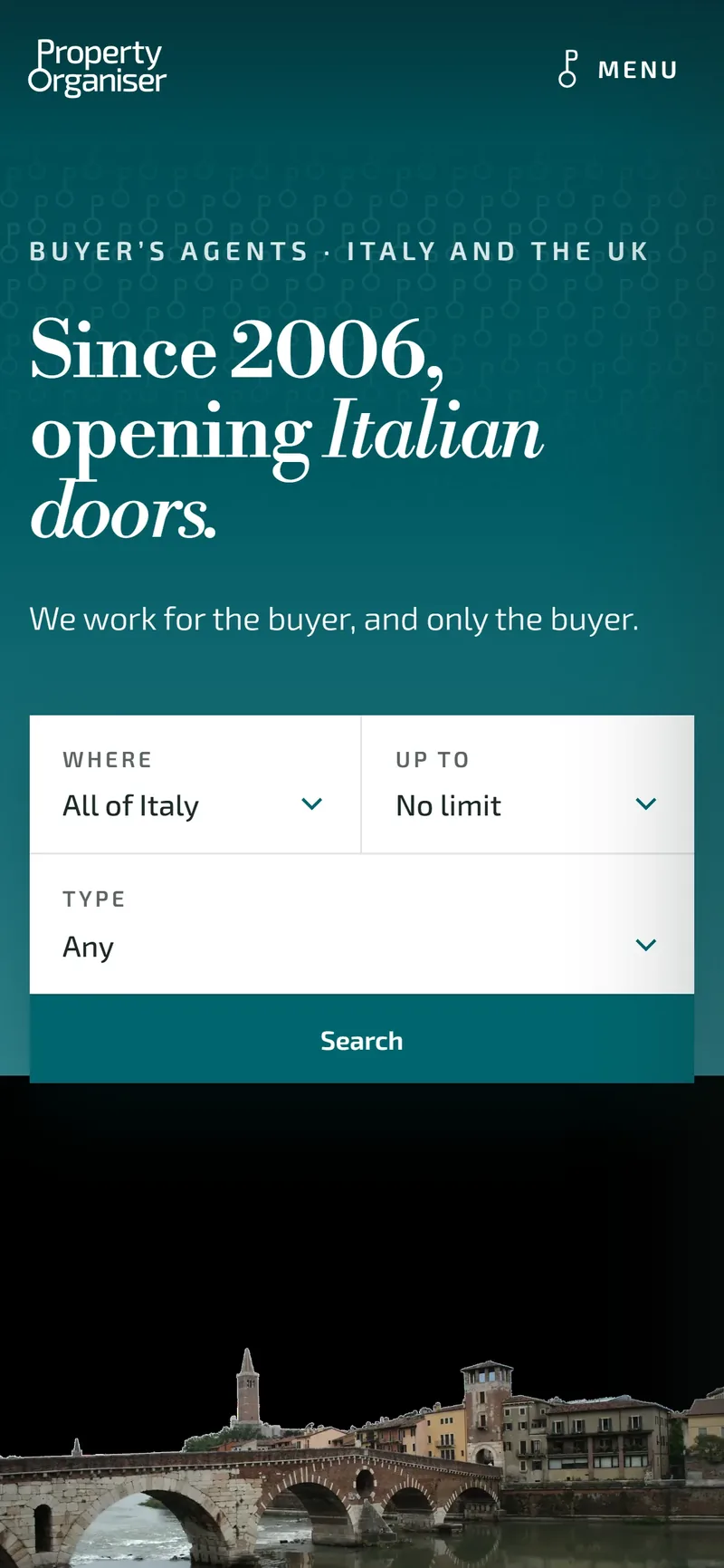
- New homepage. Since 2006, opening Italian doors, with the property search up front.
- Key, found in the logo. Your key solution to real estate.
- Twenty regions, walked
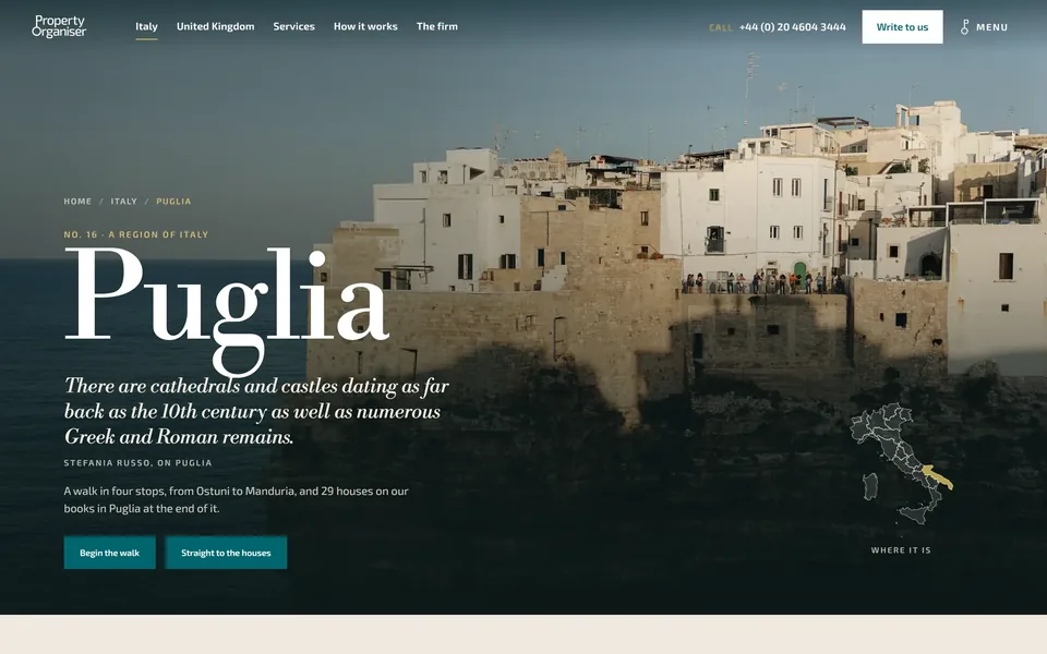
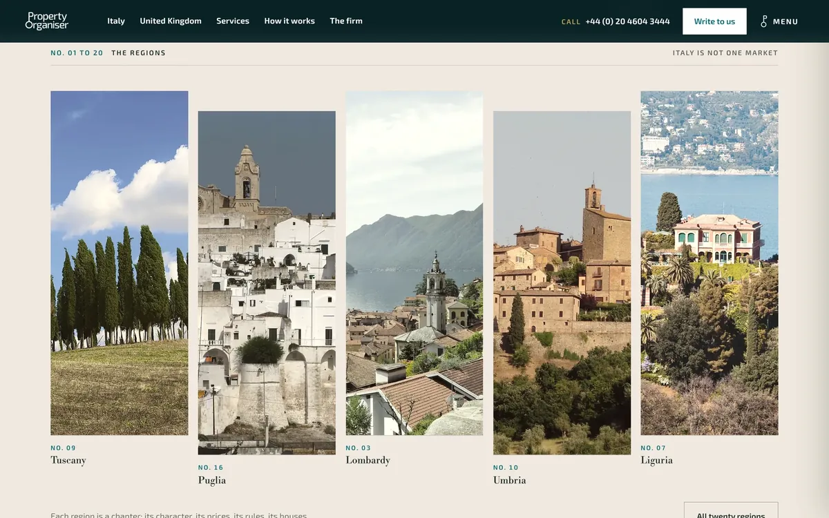
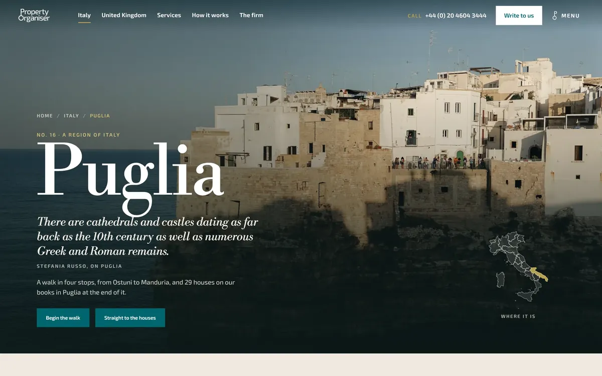
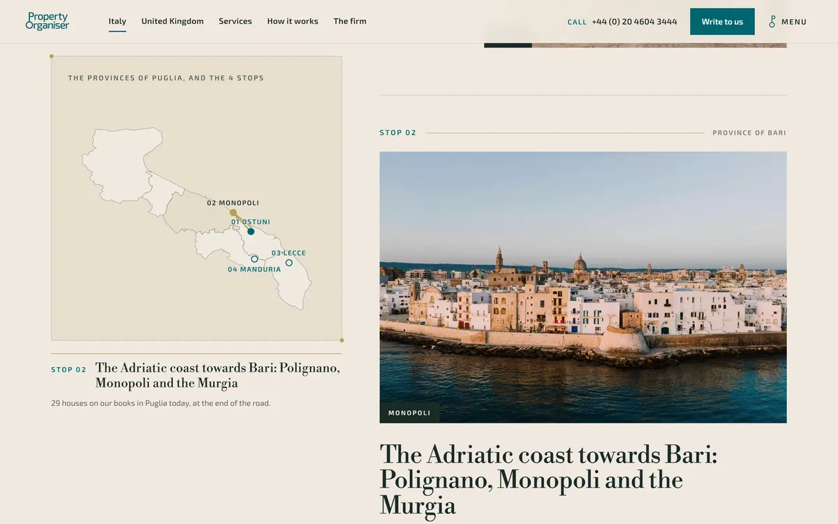
Each region page is a walk on its real map: four stops, a brass road drawn as you scroll, nine photographs chosen from thousands.
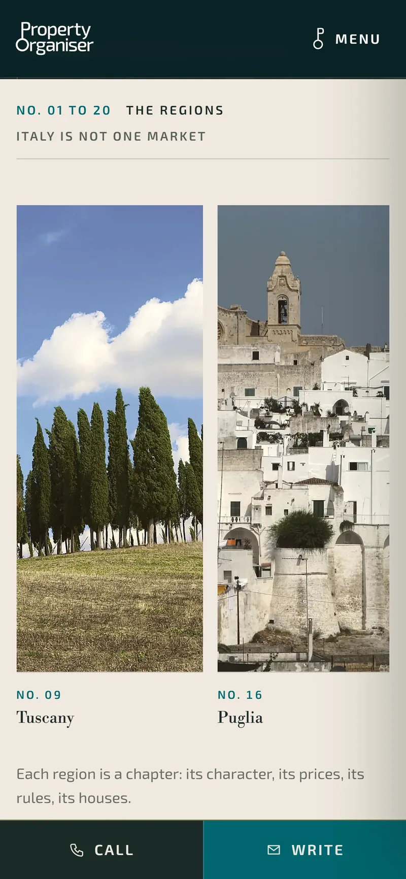
- The twenty Italian regions. Each one a chapter.
- Region page for Puglia. A walk in four stops, from Ostuni to Manduria.
- The province map. Follows the reader down the coast to Monopoli.
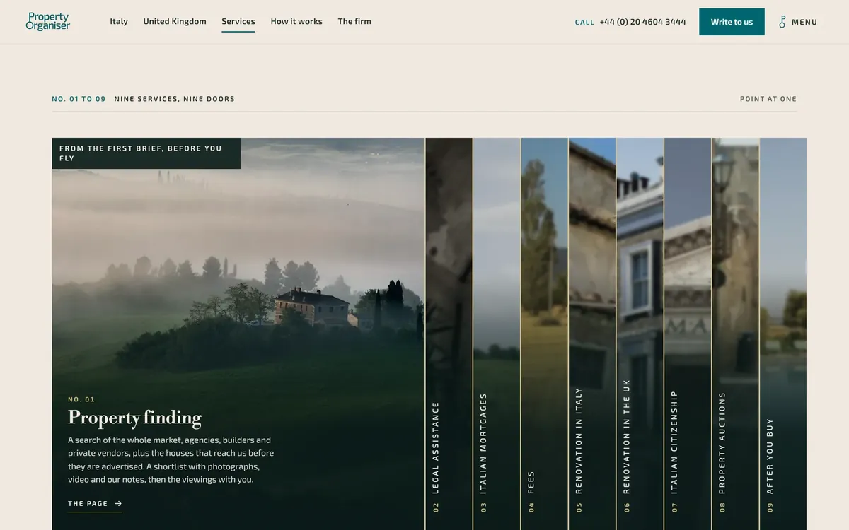
- Services as nine doors
An aperture rail where each service opens like a door, instead of a list of boxes.
- Nine services, nine doors. Pointing at one opens it.
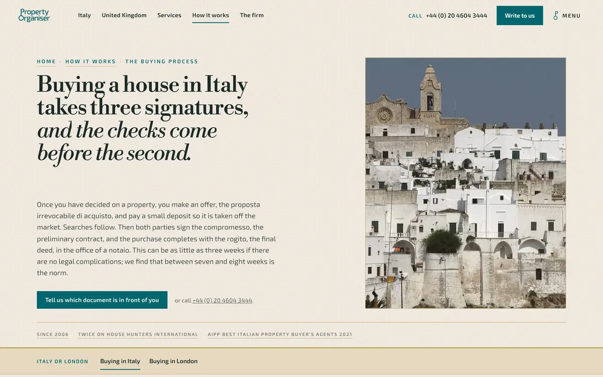
- How it works, as a corridor
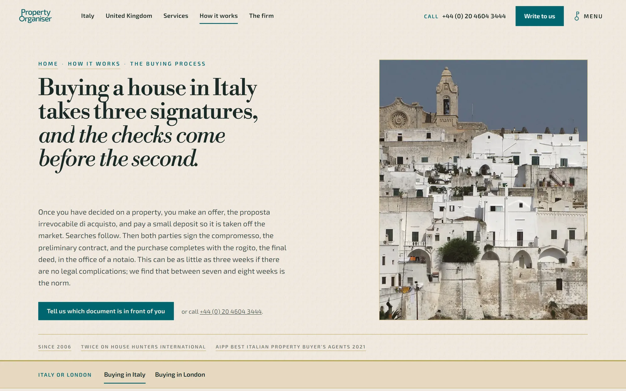
The buying process becomes a corridor of four stations, from the first search to the notary’s table.
- How it works. Buying a house in Italy takes three signatures.
The system
Twenty regions, walked.
Each region page is a walk on its real map: four stops, a road drawn as you scroll, photographs chosen one by one.
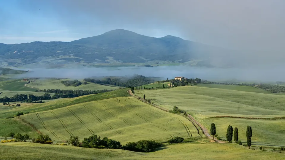
01 · Region
Tuscany
Green hills near San Quirico d’Orcia, Monte Amiata in the mist.
Photograph: Phil Evenden, Pexels
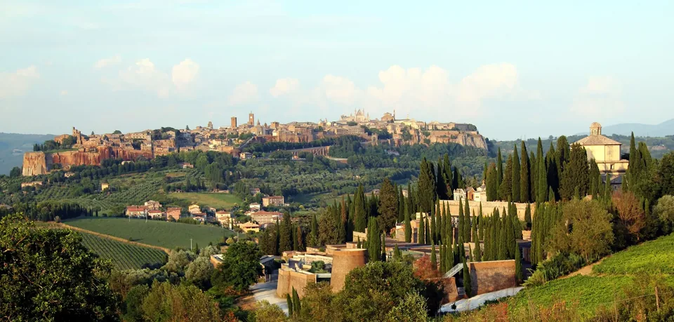
02 · Region
Umbria
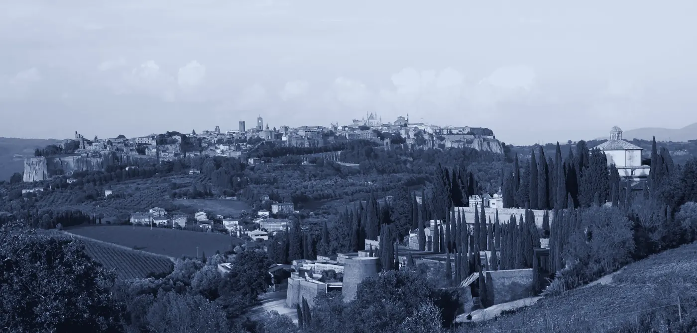
Orvieto on its tufa plateau above vineyards and cypresses.
Photograph: Marián Moravčík, Pexels
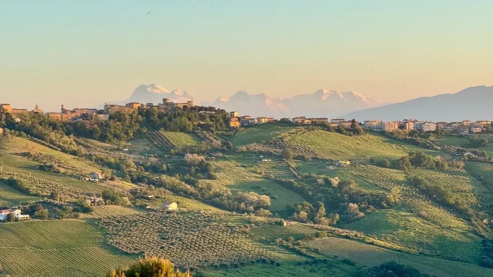
03 · Region
Marche
Olive groves and a hill town in the Marche, the snowy Apennines beyond.
Photograph: Geert Rozendom, Pexels
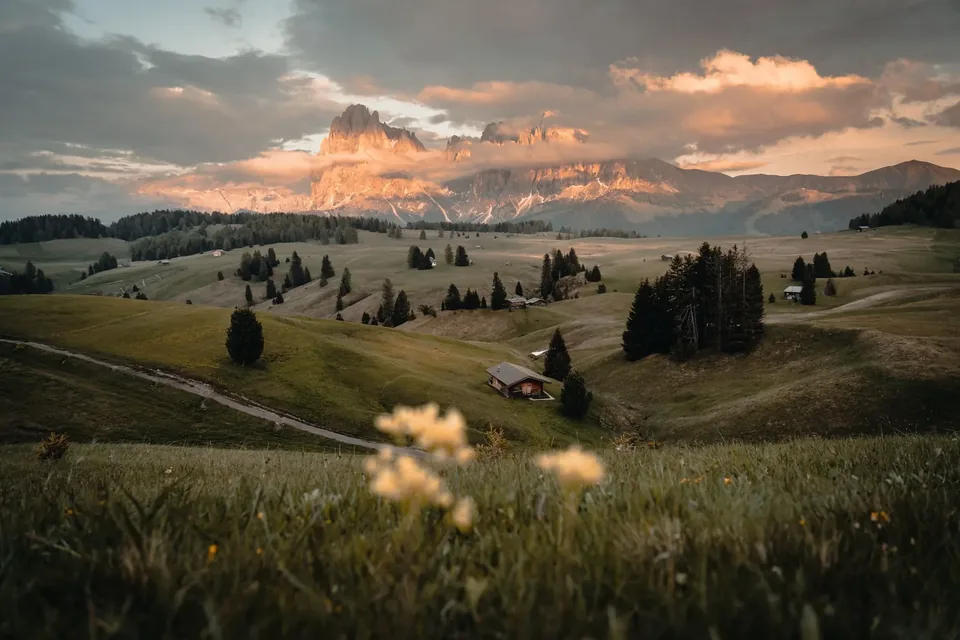
04 · Region
Trentino
Alpe di Siusi meadows and huts under the Sassolungo.
Photograph: Julien R, Pexels
Films
The brand, moving.
A brand film made for the new identity.
The work, up close
The new site, region by region.
Pages from the new site: a region walked stop by stop, the buying process, the nine services.
Where it stands
A brand that finally says what the firm does.
The identity is approved and the new site is in its final phase before it moves to the firm’s own domain. For the first time, a foreign buyer landing on it sees an agent on their side, and a country they can walk through before they fly.
Not a sales call. A diagnostic.
Thirty minutes. We map how your clients research you today against how they actually decide, and we name the gaps.